Assignment #3 & #4
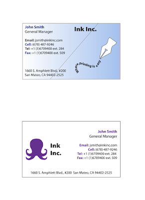
This assignment was one of my favorites as it was the first assignment that I could see me using in the real world. I started by Choosing a logo and outlining it. I got inspiration from the company custom ink as I really wanted to outline an octopus and their logo is an octopus. I then came up with a fake company to make two logos with two different color schemes. The first card has a blue, white, and black color scheme. I made it simple, but fun. I used the curve tool and then used the text on line tool to create the same effect in assignment #2 to come up with a fun logo. I inserted the "company's" slogan in the lines and then traced an old-timey pen to add to the logo. The second card had a purple, black, and white color scheme. I used an octopus as the logo and made this card more simple. After designing both cards, I group each card together, then made the cards 3.5 x 2.


Comments
Post a Comment