Posts

Showing posts from October, 2017

Assignment #7

Image
        This project was one of my favorites as in high school I did a ton of photography and worked some with photoshop but never really learned how to use it well. I chose these images as I thought I could get creative with them. Each one I went through and edited things like exposure, contrast, saturation, etc. Then on some I changed the color balance to make them change from a blue/green to a yellow/red. On one I just made it black/white and played with the shadows/highlights. On some I used effects to make them look posterized or grainy.

Assignment #6

Image
        For this project, I chose a vector poster. The original poster was black and white, but I decided to add color and to make the gloves pop more by making them white. To create this, I used skills I learned previously to create other projects like the banana and the business cards. I just simply traced and recreated the image by using the curves tool and adding color.

Assignment #5

Image
        For this, I felt kinda funny designing a fruit, but it helped me pay attention to detail and learn how to rebuild an image. I thought designing this banana was almost therapeutic as I had to be really tedious and work really hard on it to make it look like an actual banana. I chose an image of a banana off of google images, then got to designing. I used the dropper tool on almost every line and area of this banana to get the correct colors. I used the grid tool to divide off the banana into sections to colors correctly. I then had to color all of the spots and the stem which involved a lot of outlining, shading, and positioning. After shading, I would adjust the opacity and I would fade the spot into the banana to make it look more realistic.

Assignment #3 & #4

Image
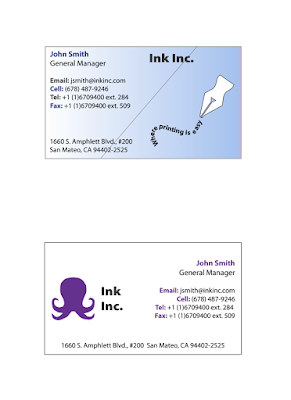
        This assignment was one of my favorites as it was the first assignment that I could see me using in the real world. I started by Choosing a logo and outlining it. I got inspiration from the company custom ink as I really wanted to outline an octopus and their logo is an octopus. I then came up with a fake company to make two logos with two different color schemes. The first card has a blue, white, and black color scheme. I made it simple, but fun. I used the curve tool and then used the text on line tool to create the same effect in assignment #2 to come up with a fun logo. I inserted the "company's" slogan in the lines and then traced an old-timey pen to add to the logo. The second card had a purple, black, and white color scheme. I used an octopus as the logo and made this card more simple. After designing both cards, I group each card together, then made the cards 3.5 x 2.

Assignment #2

Image
        For this assignment, I chose to outline a sea turtle since they are my favorite animal. I used the curve pen tool to outline the sea turtle, then I inserted a textbook that put the words along the lines that I outlined. I chose a sea turtle poem to insert along the lines. This was one of my favorite assignments so far because it was so fun and turned out looking really unique.

Assignment #1

Image
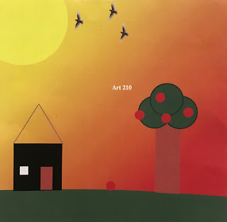
        For our first assignment we coded a picture layer by layer. For my picture I decided to do a landscape picture of a house and yard with a sunset in the background. In the yard I decided to add an apple tree. It took a lot of patience to be able to code piece by piece in order to see the larger picture. I learned how width is where the object is positioned(left or right) on the picture and height is where the object is positioned(up or down) on the picture.